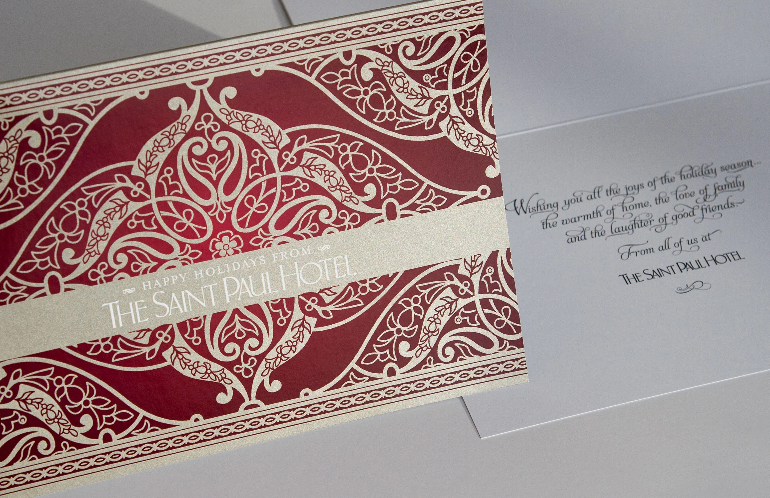
Project: A 16-page, annual holiday booklet promoting all of the hotel's holiday events, and accompanying holiday card. I used an ornate, non-holiday themed, cover to reflect the classic, European elegance of The Saint Paul Hotel which would also print dramatically with a spot metallic.
After searching for a new cover illustration and not finding what I wanted, I decided to use an illustration similar to the 2015 cover. It is an entirely different illustration, but shares similar pattern elements.
My role: Creative direction, design, production, art and print buying, stock art modification, photography for 19 of the 22 photos, copy editing and assisted with copywriting.
Printing: The cover spread features a spot Premium Metallic ink, PMS 10364 pale gold. Printed on Sappi Flo Dull with satin aqueous on inside spreads. The script font is Aphrodite Slim Pro. an elegant, easy to read script with over 1,000 glyphs.
Programs used: Adobe Camera Raw, Photoshop, Illustrator, InDesign
Additional images: Accompanying holiday card, digitally printed with metallic ink. Stock art cover ideas – the center, light blue image is the cover image.
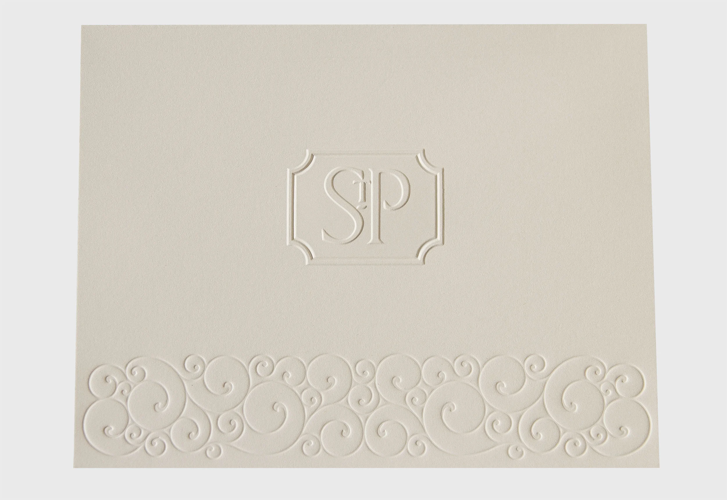
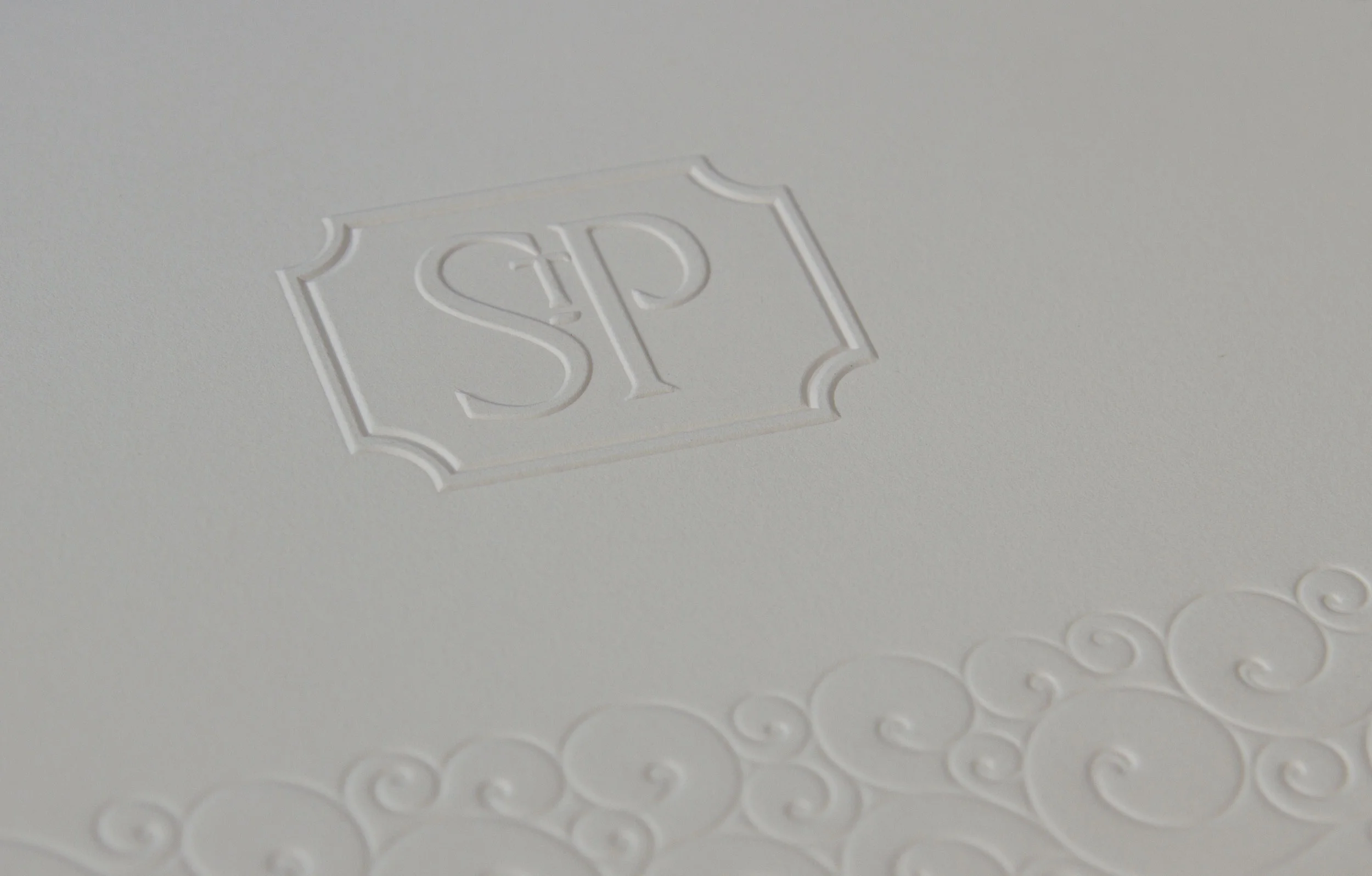
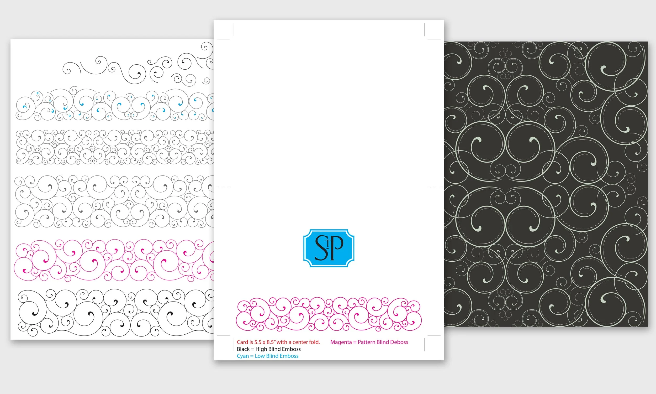
Project: This note card is the hotel's main correspondence card and is also used as a thank you and amenity card. I designed this card to dovetail with the new sales kit folder and hotel stationary I created. It has a similar multi-level emboss and deboss design as the sales folder.
My role: Creative direction, design, production, art and print buying, stock art modification and illustration.
Printing: No ink or color is used. The card is embossed on Cougar Natural and features a multi-layer embossed logo and debossed scroll design.
Programs used: Illustrator and InDesign
Additional notes & images: Original scroll stock art illustration is in dark gray on the right. On the left are all my modifications. The cyan in the scrolls show that all the scroll ends are separate shapes. The magenta design is the final design used for the notecard. In the middle is the file sent to the embosser.
Scroll designs and wrought iron work are ubiquitous throughout The Saint Paul Hotel, inside and out. These photos are just a few of many examples.
All the hotel's collateral needed to be redesigned. There is so much rich color, classic opulence and texture in the hotel, I wanted the hotel to have a pattern that was classic yet modern, This scroll design has a modern edge to it and is cleaner than traditional scroll work.
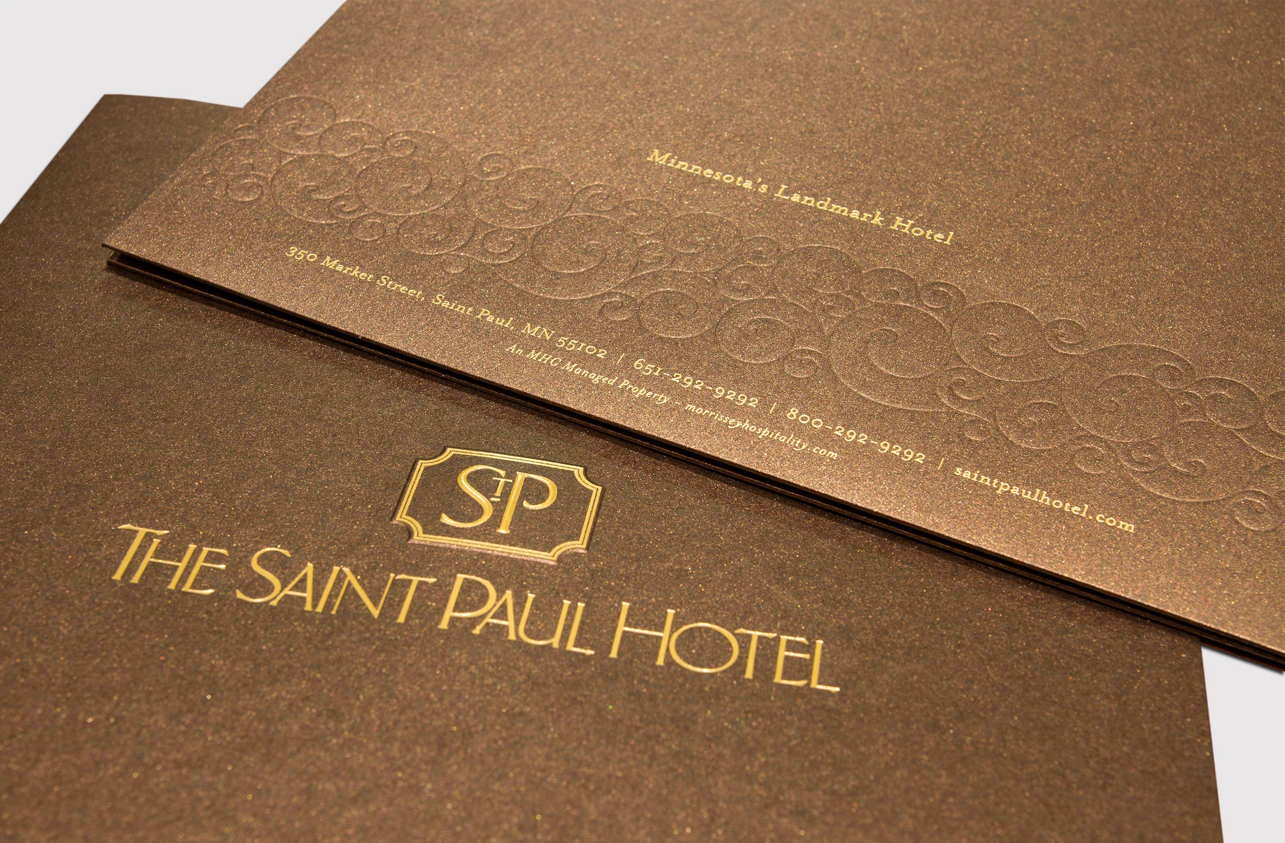
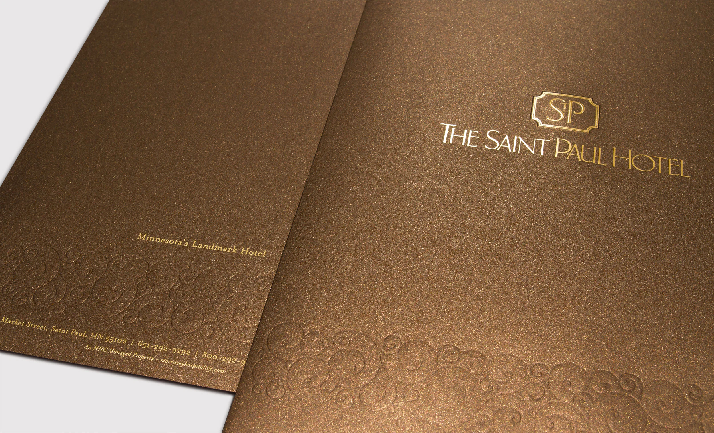
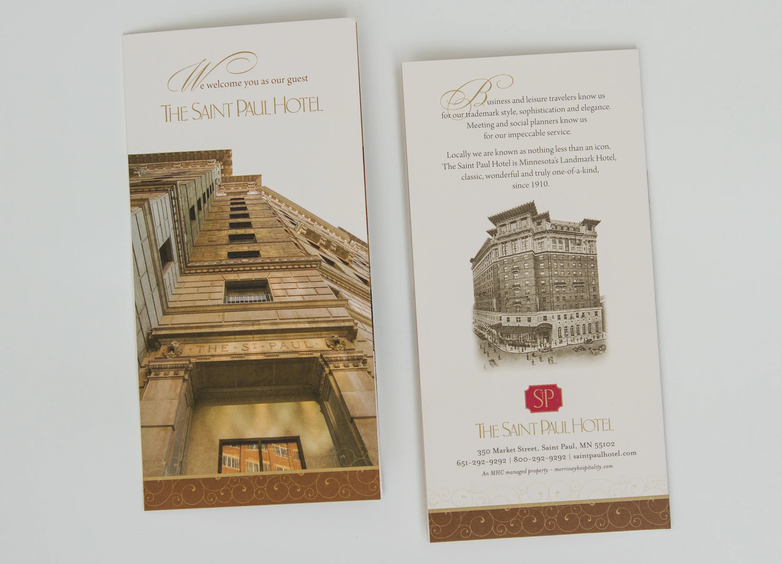
Project: Sales kit, letterhead, business cards and sell sheets for The Saint Paul Hotel. All of the hotel's collateral pieces, letterhead and business cards needed to be redesigned. The old collateral was stark black and white, based on an ad campaign along with left over designs from a pervious time. Three different brand fonts competed with each other.
It was time for a redesign and unification of the brand. Though highly successful in ads, the stark black and white design with minimal text was not the best solution for the sales kit.
The hotel was in a time of flux, having just celebrated its centennial with special branding and special business cards, now it was reverting to old business card shells with Bernard Modern font paired with letterhead and sell sheets using Mrs Eaves font.
My goal was to create a sales kit to complement the luxurious elegance of the hotel. The hotel lobby, meeting rooms and suites are adorned top to bottom with rich textures, and a warm palette of golds, bronzes, creams and ivories. I wanted the sales folder to reflect the feeling of being in the lobby. After a long journey of designs and presentations, everyone agreed the Stardream Metallic Bronze folder with matte gold foil and multi-layer embossing and debossing was a perfect fit for The Saint Paul Hotel.
My role: Creative direction, design, production, art and print buying, stock art modification and illustration, copy editing, some copywriting, and some photography.
Printing: The folder is matte gold foiled, embossed and debossed on Stardream Metallic Bronze and diecut. The letterhead is printed on Cougar Natural with a metallic PMS 10127 pale gold ink. The business cards are printed on Cougar Natural 130# card stock and foiled with matte gold foil and diecut. The sell sheets are printed offset on Sappi Flo Dull with a satin aqueous coating.
Programs used: Adobe Camera Raw, Photoshop, Illustrator and InDesign
Project: L'etoile brand identity, photoshoot and collateral. L'etoile "the star" is The Saint Paul Hotel's bridal preparation space. It was a brand new space, created from a housekeeping storage space and the first of its kind — no other other Twin Cities hotel had a dedicated get ready space.
The room was designed to be light, airy, timeless, sophisticated and elegant. The brand needed to reflect all of these attributes and appeal to brides. I designed the logo as the interior designer was finishing the space.
I chose Aire for the logo type, a beautiful display font with over 1,000 glyphs. However I didn't think Aire's capital "L" was the right fit for this logo, so I created my own "L" by combining Aire's "S" and "L". I used a satin gold brass for the door plaque to coordinate with the room's palette of metallic gold and silver accent colors.
My role: Creative direction, photoshoot art direction, design, illustration, production, art and print buying, copy editing, some copy writing and some photography.
Printing: The door sign has a satin brass finish. The brochure is printed on Sappi Flo Dull with spot metallic PMS 10340 soft gold ink. The in-room menu and welcome letter (not pictured) are printed with black ink on Stardream Metallic Opal paper.
Programs used: Adobe Camera Raw, Photoshop, Illustrator and InDesign
Additional notes & images: L'etoile room interior photo. "One Suite Day" — Minnesota Bride ran a featuring on eight Twin Cities Bridal Suites. Of all the photos, Minnesota Bride chose my photo of L'etoile for the article's full page cover photo! Bottom: a sampling of the logo development.
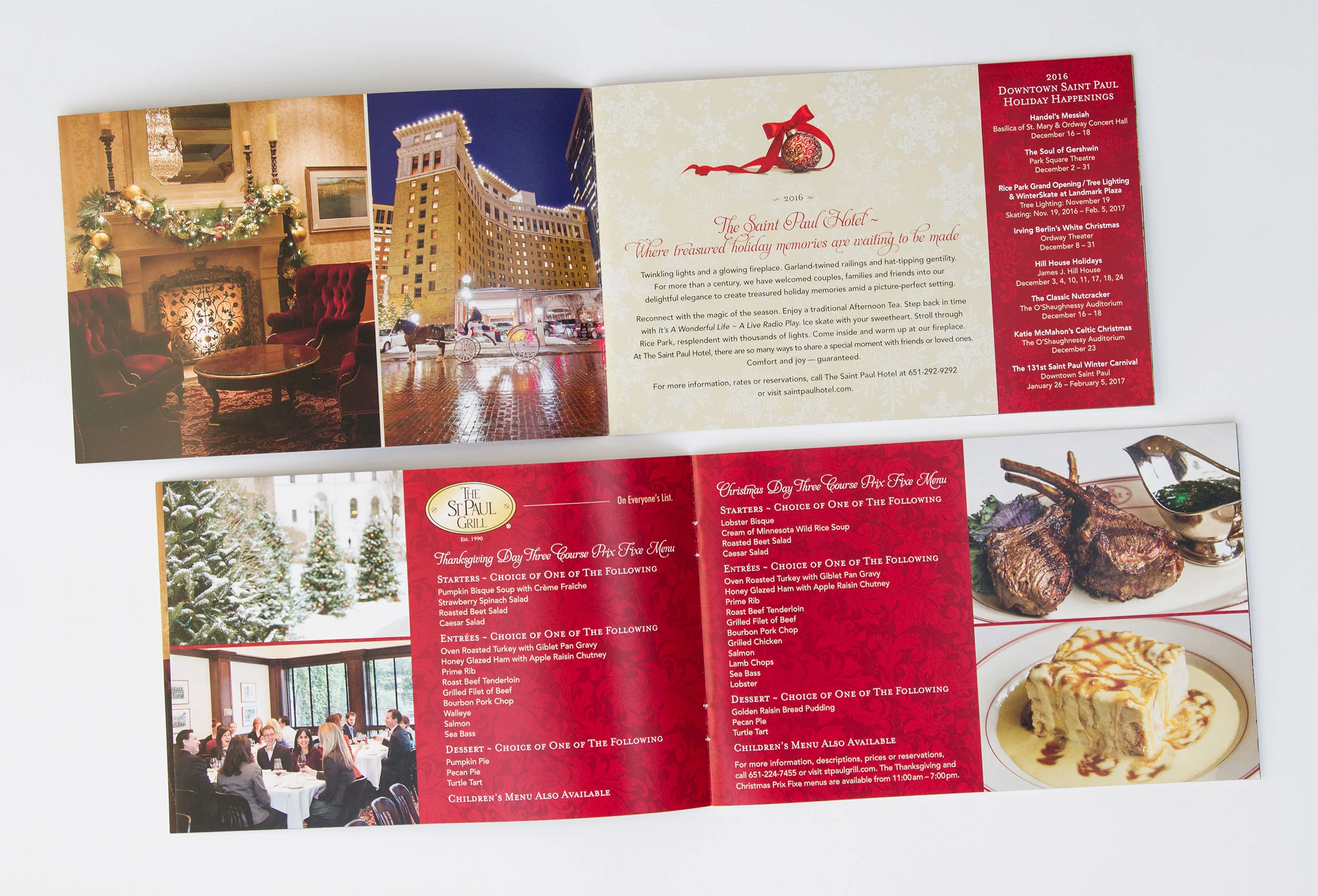
Project: This 16-page bound booklet details completely all the different menu items and wedding package offerings. It features the scroll design. This wedding booklet replaced a three-panel wedding brochure and menu.
My role: Creative direction, art direction, design, production, photography for 13 of the 24 photos, print buying,copy editing and some copywriting.
Printing: Printed offset on Verso Anthem Plus Matte paper, then printed digitally on Utopia Matte.
Programs used: Adobe Camera Raw, Photoshop, Illustrator, InDesign
Project: Redesigned guestroom key card and key card folder. I created this design to meld with the other updated brand identity items. This features the same scroll design, gold and bronze design details of the sales kit and stationary. The key card displays a 1910 photo of the hotel after it first opened. Revision and removing some of the copy of the previous version was an interdepartmental collaborative decision.
My role: Creative direction, design, production, photography of the lobby photo, print buying, copy editing and some copywriting.
Printing: Printed offset on Cougar Opaque. The uncoated paper gives the piece extra warmth and is easier to write on for guest service staff and hotel guests.
Programs used: Adobe Camera Raw, Photoshop, Illustrator, InDesign
Project: Two new postcards for The Saint Paul Hotel featuring downtown St. Paul's most popular seasons; summer and winter. The previous postcard designs and photos were over 10 years old and needed to be updated.
I was fortunate with the winter shot. I only had time to a take a couple of shots with the lighting and the horse and carriage. Fortunately it turned out well. The wet brick streets enhance the reflections nicely.
The garden photo was much more challenging, I've been photographing the hotel's beautiful English garden since 2012. I've taken hundreds of photos of the garden. After trying many angles and many different bloom cycles (the garden's flowers change almost weekly), I was very happy to have gotten this shot. It has a beautiful balance of different blossoms and colors. Eveything looks fresh and bright.
My role: Creative direction, design, production, photography of both photos, print buying, copy editing.
Printing: Printed offset on C1S (one side coated paper) with a UV finish.
Programs used: Adobe Camera Raw, Photoshop, InDesign
The Horse and carriage adds to the ambiance of this historic hotel.
Photography and design by Laurie Sugiarto
Photography and design by Laurie Sugiarto
Reynold D. Philipsek has been a professional musician since he was fourteen years old.
Reynold has recorded 49 CDs. Of these I am honored to have designed the packaging for 25 of them!
Reynold has toured with jazz singer Connie Evingson and played with French Gypsy Jazz master Dorado Schmitt during his 2005 U.S. tour. He has made numerous television and radio appearances both local and national. He was nominated for a Minnesota Music Award three times between 1994 and 2006. He was also a Guitar Player Magazine nominee in the Jazz Poll six times.
Reynold’s music is strongly influenced by Django Reinhardt but also has strong American post-bop roots where, among his many influences, he counts Wes Montgomery and Pat Martino. His albums feature primarily original compositions, though jazz standards are also sometimes essayed. His influences as a composer include Piazzolla and Monk.
Projects: For many of the designs Reynold requested packaging designs reminiscent of the Blue Note Jazz album covers of the 1940’s-1970’s. He often asked for me to create and include "Stereo," "LP," and other logos similar to the old "Hi-Fi" albums.
He also requested some of the CD disc art look like old 45s. To achieve this I created an Illustrator file of "record grooves." This was silkscreen printed with matte ink over glossy ink to resemble an old record, complete with tactile groves, creating a unique look and texture.
My role: Creative direction often collaborating with Reynold, though sometimes he'd say "I'll leave it up to you", design, production, illustration and art buying for some of the titles.
Printing: Packaging is a mix of offset and digitally printed cardboard sleeves, cardboard digi-paks and inserts in traditional jewelcases. CD art is a mix of silkscreen printing, offset and everest printing.
Having designed 25 unique CDs for Reynold, it is nearly impossible for me to choose my favorites to highlight, I have included about half of them. It has been an immense pleasure working with Reynold!
Below is a complete list of all CDs I have designed for Reynold — 23 can be found at Reynold.com.
A Life Well Played (CD- to be released in June and Documentary DVD)
Duet
Quintessence
East Side Astoria
Simplicity
Rava Avis
Last Summer
Tales From The North Woods
All The Things You Are
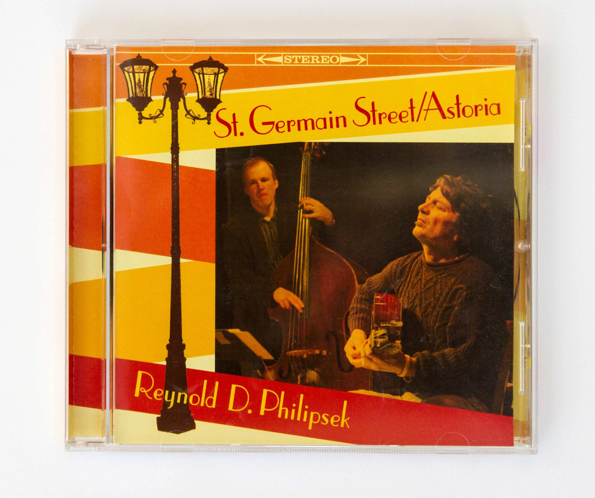
St. Germain Street/Astoria (EP CD, this one is not on Reynold's website)
Imagine That
Cottage Industry
East Side
Anthology
What It Is
Artifacts And Curiosities
25
Bistro
Grey Chalet
Three Piece Suite
Now What
Themes For Imaginary Movies
Middle-Aged Child Prodigy
14 Pieces For Guitar
Paris Suite
From Randy's website: "Randy Sabien is a bluesy, rockin', swingin', funky, jazz violinist. With an intensely rhythmic, vibrant and inventive style."
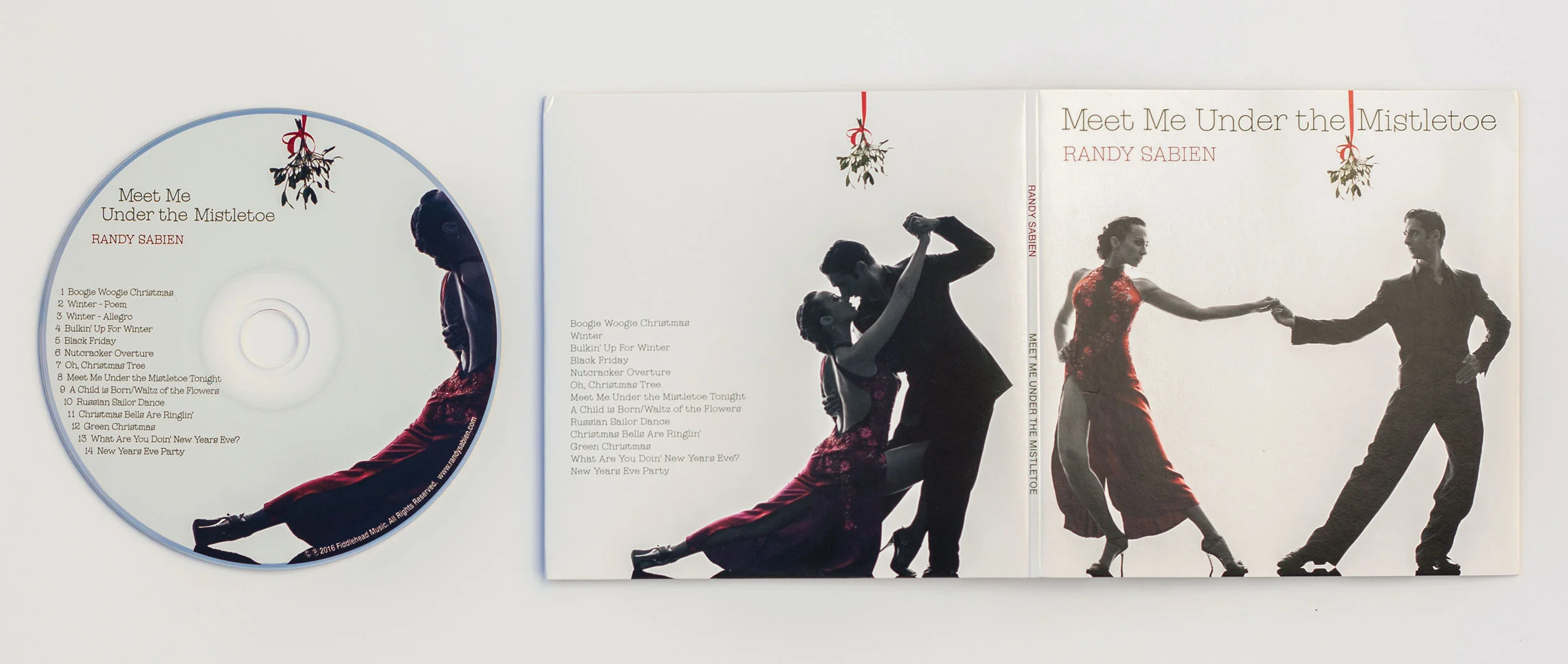
Projects: Two CDs: Soul of a Man and Meet me Under the Mistletoe.
My role: Soul of a Man — Creative direction collaboration with Randy, design, production. Meet Me Under the Mistletoe — Creative direction collaboration with Randy, design, production and art buying.
Printing: Both pieces are cardboard sleeves, printed offset, with offset printed CDs.
The CD "Dinkytown Highway" from the Maeflies, an alternative-country-rock band, features rich harmonies, hot guitars and songs that tell a story.
From the Maeflies website: "The Maeflies album Dinkytown Highway is a new blend of Americana rock & roll and Cosmic American Music. Dinkytown Highway, with a nod to the iconic Minneapolis enclave, takes the rich vocal harmonies and rawboned rock and roll of the Maeflies to new heights. a route to and from a place both real and imagined. Join them as they share stories of love lost and found, the people met, the places discovered. Where the song on the radio reminds you it is, after all, mostly about the trip."
Project: Six panel digi-pak, CD, poster, banner and t-shirt design.
My role: Design, (creative direction by lead singer Mae Rukavina), illustration of highway sign, photography (Dinkytown wall), and production. I designed an accompanying poster, banner and t-shirt for the Maeflies CD release concert.
I also helped create the Band's website on Wordpress and some of the graphics.
Printing: Six panel digi-pak printed offset and offset printed CD.
This project was a tremendously fun project to be a part of. The photos of Mae and the band are awesome and tell the story of getting to Dinkytown.
Project Dance with the Stars: Packaging for a 10-page roll fold CD "Dance with the Stars" full CD, and 4-page "Dance with the Stars" EP CD. New age musician Gabrielle Angelique desired a fairy tale, ethereal "Lord of the Rings" look for her first vocal Celtic CD Dance with the Stars.
Gabrielle weaves reality and fantasy together in her unique way, creating a world of evocative music where imagination soars.
While searching for art images for this project, I came across Arthur Rackman's Illustrations which ended up being perfect for this CD! His illustrations completely convey 100% the look and feel of this CD.
I wove many stand alone illustrations together to create a single 23" long cohesive story on one side and a second 14" long story on the other side. This was such an exciting project to work on. I loved every minute. Gabrielle is an amazing client to work with.
My role: Creative direction collaboration with Gabrielle, design, production and art buying.
Printing: Both full CD and EP CD: printed offset, CD printed offset, packaged in jewel case.
CD review of Dance with the Stars: I have to admit that when I received "Dance With the Stars" for review, I was a bit skeptical. Celtic music was done to death a few years ago, so I was happily shocked to be completely blown away by Gabrielle Angelique's incredible voice and amazing story songs ... Several of the songs are fairy tales that charm with their innocence and purity, but others are darker and more painfully emotional.
The tales are fascinating — mermaids, fairies, Wuthering Heights, lost love, found love, a bonny boat — and all of the lyrics are included in the beautifully illustrated booklet that accompanies the CD.
Some of the songs are original, some are traditional Celtic songs, and some are cover tunes, yet the whole album is a cohesive package. I hate to gush, but this CD has really captured my imagination! ... The title track opens the CD with a feeling of mystery. One of the darker melodies, the words and Angelique's sweet voice immediately draw you in and prepare you for the journey into days of old and fairylands where anything is possible ... What a knockout of an album! Very highly recommended! — Review by Kathy Parsons
Interview with Gabrielle, Dance With The Stars by Musical Discoveries: What are you trying to connote with the title and imagery used in the album's artwork?
"I wanted a dreamy, starry, fairytale looking album. I chose a really great photographer. Her name is Dawn Glesener. I explained that I wanted a Lord of the Rings effect and she really captured some great pictures. It's a little embarrassing at the shows when a customer picks up my new album and looks at me than looks back at the album and asks, "Is this you?" I suppose because I'm not glowing ... and I don't have an otherworldly look like the picture ... "I'm also thrilled with my graphic artist Laurie Sugiarto. I sent her my gold master of the recording and asked her to design an enchanted fairy tale theme throughout the album and boy did she ever! She chose Arthur Rackman illustrations and blended them into the background of my lyrics. I wanted this album to be a work of art, so she placed fairies and mermaids and trees throughout the ten page foldout.
I invested a lot of time and money into the print because I wanted people who purchased the CD to feel it was worth while and I wanted the art to reflect my music. I have to admit that when I am browsing a music store the album cover of a CD catches me first and than I listen. If I pick up a CD with a cheesy cover I think, 'Well they must not have invested a lot of time in this project,' and I put it back. So I wanted every part of this project to be special." — Gabrielle Angelique
Project: The Little Albums Packaging for "The Little Albums" two disc set, a six panel digipak with a 12 page booklet. New age musician Gabrielle Angelique requested a dramatic, theatrical, celestial theme for this two-disc set, while still maintaining her ethereal identity. This project was a "Photoshop exploration and adventure into extreme layering." All the images were layered with colorful vector and raster images on top of stage-curtain backdrops.
Gabrielle gave me a file of images, fonts and some vector art she wanted to incorporate. I was able to use most of the images, but I scaled down the vector art to just six images.
The main vector which I wove into every page is a simple organic-looking vine-scroll design. I copied, pasted, flipped, mirrored and rotated this over and over to form medallion images, and then colored, tinted and used blending options and opacity for each part of the medallion to create a different medallion look for each of the 20 photo-illustrations (12 page booklet, 6 panel digi-pak and 2 CDs).
This was the most intense, exciting photoshop layering project I have done! Both Dance with the Stars and The Little Albums were an absolute thrill to design.
My role: Creative direction collaboration with Gabrielle, design and production.
Printing: Offset printed on card stock as a six panel digipak with diecut and pocket, 12 page booklet insert and two CDs printed offset.
Additional images: Two of the vector illustrations in their original form used for The Little Albums.
I've edited dozens and dozens of photos. Some clients requested I remove a person or object. Others asked me to take years off their faces.
Here is just a small sampling of some of the photo editing I've done.
Projects: (top to bottom) JoAnn Funk — JoAnn desired a dramatic photo of herself for the cover of her "Pick Yourself Up" CD. I adjusted the color and saturation of her original photo and created a background from some of the background lights (not pictured) using one of her favorite colors, teal, which also highlighted her eyes. I was also the designer for this project.
Julie Lee — Julie wanted to have the building removed from the photo and a soft evening sky added. This was challenging to do with the car. The building lines were reflected all across the hood and also visible through the windshield.
The Saint Paul Hotel — Our model was beautiful and elegant, she just needed to have her neck and arms cleaned up a bit.
JoAnn Funk — JoAnn requested I remove her bass player from this photo. The photoshoot didn't include any without him in this pose so I had to carefully remove him. I also removed some sallow tones from the photo and smoothed out the harsh shadow lines.
Gabrielle Angelique — This was such a fun project. For her "Dance with the Stars" CD I got to weave illustrations around her photo to give her a "Lord of the Rings" etherial look.